How to Read the Charts
The charts visualize why trades execute or are ignored.
Below is an example of what the Strategy Lab delivers. This example is a simulation of the daily BTC-EUR market pair.
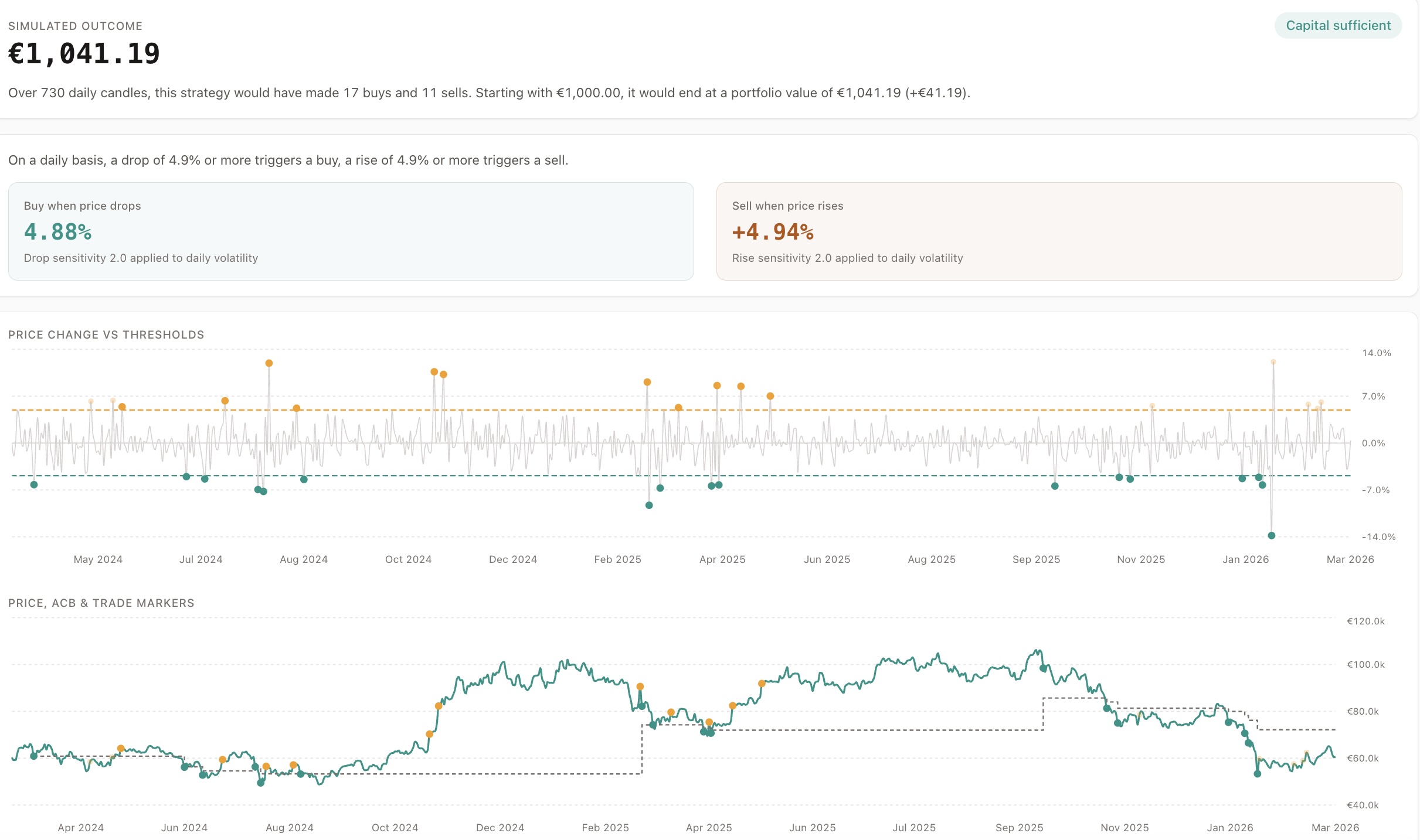
Delta % Chart (Top)
Section titled “Delta % Chart (Top)”Shows:
- Candle-to-candle price change
- BUY and SELL thresholds
Use this to spot:
- Trigger density
- Clustering risk
Price Chart (Bottom)
Section titled “Price Chart (Bottom)”Shows:
- Market price
- Executed trades (solid dots)
- Ignored trades (faded dots)
- ACB line (grey)
Key Visual Signals
Section titled “Key Visual Signals”- SELL below ACB - loss protection
- SELL above ACB but ignored - no inventory
- Dense BUY dots - clustering
This chart is your strategy X-ray.